Friday, May 6, 2011
Thursday, May 5, 2011
Tuesday, May 3, 2011
Tuesday, April 12, 2011
Couch Trolltato
Monday, April 11, 2011
Face Hero
1. This mini movie took a bit of time to complete, it's not well drawn, but I tried to make as lenghty as possible, I think it turned out pretty good in my honest opinion.
2. I feel pretty successful about this piece, because I put a lot of time into making it sync up with what I wanted to happen.
3. The motions worked out pretty well, since each scene was different in some way, I had to make it look fluid. Some scenes look as if they didn't have much effort put into them.
4. I would learn to draw better and have sounds in it.
5. Having the focus to redraw each part to make it look like an actual motion instead of making it look like it like they defy the laws of gravity.
6. I learned how to effectively use the onion layer, it really helped.
Wednesday, March 30, 2011
10 Unbelieveable School Ideas
Tuesday, March 29, 2011
3D images


Tuesday, March 22, 2011
Thursday, March 17, 2011
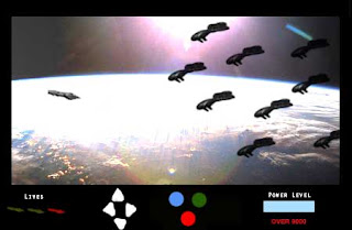
Game Project 1

1. This piece looks pretty cool, a couple of minor details are in it.
2. The piece was successful because it was meant to look like an old arcade game.
3. The project turned out better than expected, the lighting makes it look cool, yet some areas are off balance such as the "Lives" down in the corner.
4. I would try to align the drawings up better, they just seem off.
5. Getting it to not look so cheesey. It still looks cheesey, but not as bad as I thought.
6. How to abuse the lens flare option.
Wednesday, March 16, 2011
Music Project

1.This piece is kind of sloppy to be honest, could have done better.
2. It worked in several ways, got the correct stamp, and the color waves look nice.
3. The note brush worked fairly well, it looks off in most areas.
4. I would add more detail into the picture, make it a bit more entertaining to look at.
5. Getting the picture stamp to match up with the background, though it looks cool, I would put more color into it.
6. I learned how to expand and make realistic objects into 2D stamps.
Thursday, March 10, 2011
Wednesday, March 2, 2011

1. This piece looks pretty cool, couldn't think of anyone else to turn into text so I picked the Joker.
2. I thought this piece was pretty successful, it's not uncommon, but still looks pretty cool.
3. The way the text lined up was pretty nice. Though It still seems a bit too dark when your looking at it up close.
4. I might choose a different picture of the Joker, one that doesn't have so much darkness in it.
5. Getting the picture to stand from the rest of the black surrounding the picture.
6. I learned how to turn photos into text portraits, which I think is pretty amazing.
Tuesday, March 1, 2011
Monday, February 28, 2011
Friday, February 25, 2011
Thursday, February 24, 2011
Tuesday, February 22, 2011
Speech
Character from Matt McLean on Vimeo.
1. In short it's a short rough idea of what I tried to do, the lip sync worked well
2. I guess it was pretty successful, though it doesn't look as good as some of the others people have made. Haven't used the mic, so the voice could sound better.
3. The voice worked the way I wanted it too. The mouth motions look a litle off.
4. I would take more time in drawing the surrounding area and character looks.
5. The most difficult part was haveing the mouth sync up with the words.
6. How to place voice recordings in an animation.
Wednesday, February 9, 2011
Tuesday, February 8, 2011
Wednesday, February 2, 2011

1. Looks pretty cool.
2. Made it look like a realistic drawing.
3. The filter worked fine, couldn't really put to many colors in from doing this though.
4. I would add more details, not just make it black and white.
5. Getting it to look even rather than to dark or light.
6. You can make any picture look awesome with a few moments of your time.
Monday, January 31, 2011
Clones

1. It's an odd piece, that much is for sure.
2. I feel that I could have worked a little more on this, it does look a bit rough since I'm getting back into the swing of things with photo shop.
3. The pictures worked relatively well with each other, yet the frames overlap each other.
4. If I were to do this project again, I would make it crisper and easier to look at.
5. The most difficult about this project was getting the frames to line up without making it look to off sides.
6. How to put multiple pictures in the same picture without making it look poor.


