Wednesday, March 30, 2011
10 Unbelieveable School Ideas
1. Have the school perched on a tree branch, theough the school would look a bit off, give it a look to make it seem like it's growing out of the wood in which it is sitting upon. 2. The school is placed on the moon, give it a futuristic look so it can be somewhat believeveable, such as a giant glass dome surrounding the campus. 3. A school placed on a large cloud, the cloud would have a misty look to it. Since it is in a cloud have sun light breakig through certain points, to give it a similar look to what a cloud would look like. 4. Have a school sitting in the palm of an individual, make the ridges of the persons hand look as though they are enclosing the school to give it a sense of entertainment. 5. A school placed precariously on a mountain top, the school is leaning to the side slightly. Pieces of rubble are falling from the schools bottem to make it seem as though the school was taken from its original setting and placed in the mountain tip without a care. 6. Have a school swirling in a tornado, have random objects swirling around the school to give the impression that this a massive tornado and is having an effect on the area around it. 7. The school is placed in a rain drop hitting the ground at the right moment, making it look like the school is splashing like a rain drop would when it hit the ground. 8. A classroom filled with water, objects would be floating around and some would be buoyant and floating to the surface. the desks would remain on the floor though, giving the idea of a carefree world where anything can happen. 9. A student would be opening their desk to get something required for classwork, instead of school supplies though, they would be opening the door to a completely different world, such as beams of light shooting forth or something crawling out of the desk, like some sort of creature from another dimension etc. 10. An apple placed in the teachers desk with a bit taken out of it, the apple would be zoomed close up, the bite mark would have something like another classroom or an indistrialized town inside it, just ot throw the viewer off.
Tuesday, March 29, 2011
3D images


1. I believe that these pictures, though devoid of some detail, look pretty good.
2. I feel pretty successful about these pictures, they look interesting and catch the eye.
3. The way the shapes spread around the object, is cery interesting. Though they seem pretty even, the pictures could have been tended to a bit more than they already are.
4. I would take more time in choosing objects that were all in a certain theme, and stick with that.
5. Getting the picture to not look like crap to be honest, though i had to go through several shapes it was worth it.
6. I learned how to use the 3D tool in photoshop, though still a novice, I look forward to using it in the future.
Tuesday, March 22, 2011
Thursday, March 17, 2011
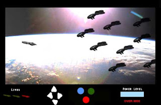
Game Project 1

1. This piece looks pretty cool, a couple of minor details are in it.
2. The piece was successful because it was meant to look like an old arcade game.
3. The project turned out better than expected, the lighting makes it look cool, yet some areas are off balance such as the "Lives" down in the corner.
4. I would try to align the drawings up better, they just seem off.
5. Getting it to not look so cheesey. It still looks cheesey, but not as bad as I thought.
6. How to abuse the lens flare option.
Wednesday, March 16, 2011
Music Project

1.This piece is kind of sloppy to be honest, could have done better.
2. It worked in several ways, got the correct stamp, and the color waves look nice.
3. The note brush worked fairly well, it looks off in most areas.
4. I would add more detail into the picture, make it a bit more entertaining to look at.
5. Getting the picture stamp to match up with the background, though it looks cool, I would put more color into it.
6. I learned how to expand and make realistic objects into 2D stamps.
Thursday, March 10, 2011
Wednesday, March 2, 2011

1. This piece looks pretty cool, couldn't think of anyone else to turn into text so I picked the Joker.
2. I thought this piece was pretty successful, it's not uncommon, but still looks pretty cool.
3. The way the text lined up was pretty nice. Though It still seems a bit too dark when your looking at it up close.
4. I might choose a different picture of the Joker, one that doesn't have so much darkness in it.
5. Getting the picture to stand from the rest of the black surrounding the picture.
6. I learned how to turn photos into text portraits, which I think is pretty amazing.
Tuesday, March 1, 2011
Subscribe to:
Comments (Atom)


